Design Any Product, Part 5: High Fidelity Designs (From Sketch to Shipped)
- Leor Wolins

- 1 day ago
- 9 min read
Welcome back to Part 5 of the Design Any Product series, the final part. If Part 4 was where ideas took their first visible form, Part 5 is where those forms become the real thing. High fidelity is the polish phase, the final 10% that takes 50% of the time but earns 100% of the trust.
This is where pixels get serious.

Every typeface choice now matters.
Every color value.
Every interaction.
Every state.
The work you do here is the spec the engineering team will build from, the deck the marketing team will pitch from, and the proof the leadership team will sign off on.
Done well, high fidelity gets your product shipped.
Done badly, you end up with a beautiful mockup nobody can actually build.

3 high-fidelity tools do most of the work in this phase.
High Fidelity Mockup Where wireframes get their final visual form: typography, color, branding, every pixel where it should be.
Creating Prototypes Interactive simulations of the real product, used to test interactions before any developer writes code.
Creating a Design Specification The handoff document that turns design intent into shippable instructions for engineering.
Three ways to make the design real.
Three ways to bridge design and development.
One shared goal: ship something that matches the vision.
Let's break each one down.

High Fidelity Mockup
The mockup is where the design stops being abstract and starts being a thing. Every typography choice, every color value, every spacing decision, every interactive state, all locked in. This is the version that goes to engineering, marketing, leadership, and the user testing lab. Get it right and the next three months get easy. Get it wrong and the rework cascades.

8 steps shape this work.
The step | What it produces |
Design completion | A fully developed visual and interactive design |
Design review | Internal and stakeholder alignment on the mockup |
Prep for engineering | Optimized assets and clean specs for handoff |
Collaborate with engineering | Early resolution of technical constraints |
Handoff to engineering | A clean delivery the engineering team can build from |
Support during build | Designer presence to maintain quality |
Feedback and iteration | Refinements informed by what was actually built |
Project completion | A shipped product with monitoring in place |
Design Completion
Overview
The high-fidelity mockup represents the final stage of the design process, where the visual and interactive elements are fully developed and refined.
Completion Criteria
Before creating the mockup, the design team ensures that all design elements, interactions, and functionalities are thoroughly conceptualized and approved.
Design Review
Internal Review
The design team conducts an internal review of the mockup to ensure that it aligns with the project goals, user needs, and brand guidelines.
Stakeholder Feedback
Feedback from stakeholders, including product managers, marketers, and executives, is gathered and incorporated into the mockup.
Preparation for Engineering
Optimization for Implementation
The mockup is optimized for implementation by the engineering team. This includes considerations for screen sizes, responsiveness, and technical feasibility.
Assets and Specifications
Design specifications, including typography, colors, images, and interactions, are documented and provided to the engineering team for reference.

Collaboration with Engineering
Feedback Loop
Collaboration between design and engineering is emphasized to address any implementation challenges or technical constraints early in the process.
Iterative Process
The mockup may undergo further iterations based on feedback and discussions between design and engineering, ensuring that the final product meets both design and technical requirements.
Handoff to Engineering
Delivery
Once the mockup is finalized and approved, it is handed off to the engineering team for implementation.
Clear Communication
Clear documentation and communication channels are established to facilitate a smooth handoff process and address any questions or concerns from the engineering team.

Support during Implementation
Design Support
The design team remains available to provide support and clarification to the engineering team during the implementation phase.
Quality Assurance
Designers may conduct periodic reviews to ensure that the implemented design matches the original mockup and meets the desired quality standards.
Feedback and Iteration
Continuous Improvement
Feedback from the engineering team is collected and used to inform future design iterations. This iterative process helps refine and improve the design over time.
Project Completion
Deployment
Once the design is successfully implemented, the project is deployed to users.
Evaluation
Ongoing monitoring and evaluation of user feedback and analytics are conducted to assess the effectiveness of the design and identify areas for further improvement.

Creating Prototypes
A prototype is the closest your team will get to the real product before code gets written. It is the test bench where assumptions about interaction get validated, where motion gets felt, where flows get tested. Done well, a prototype catches bugs that would have cost weeks in development. Done badly, it is a fancy slideshow nobody learns from.
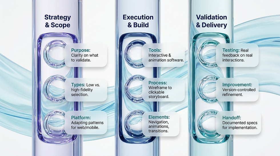
9 areas shape this work.
The area | What it produces |
Purpose of prototyping | Clarity on what the prototype should validate |
Design tools | The right software for interactive design |
Process | Wireframe to clickable prototype, iteratively |
Key elements | Navigation, interactivity, animation, transitions |
User testing | Real feedback on real interactions |
Handoff to development | Documented specs for clean implementation |
Types of prototypes | Low or high fidelity, matched to the question |
Platform adaptation | Web, mobile, or platform-specific patterns |
Continuous improvement | Version-controlled, feedback-driven refinement |

Purpose of Prototyping
Interaction Experience
Prototypes focus on simulating the actual interaction experience of the product, allowing users to interact with the design and provide feedback.
Look and Feel
Prototypes go beyond wireframes by incorporating elements of visual design, motion, and user flows, providing a more realistic representation of the final product.
Design Tools for Prototyping
Interactive Prototyping Tools
Utilize specialized software such as Adobe XD, Figma, Sketch, InVision, or Axure RP to create interactive prototypes.
Animation Tools
Consider incorporating animation tools like Principle or Adobe After Effects to add motion and transitions to the prototype.

Prototyping Process
Storyboarding
Begin by creating a storyboard or user flow to map out the key interactions and user journeys that the prototype will simulate.
Wireframe to Prototype
Use wireframes as a foundation and build upon them to create interactive prototypes. Translate static wireframes into clickable prototypes that users can navigate.
Iterative Design
Prototyping is an iterative process. Start with low-fidelity prototypes to quickly test and iterate on ideas, then gradually refine them into high-fidelity prototypes as the design matures.
Key Elements of Prototypes
Navigation
Include interactive elements such as buttons, links, menus, and navigation bars to allow users to move between screens and sections.
Interactivity
Incorporate interactive elements that simulate user actions, such as form inputs, dropdown menus, sliders, and toggles.
Animation and Transitions
Add animations and transitions to provide feedback and enhance the overall user experience. This includes transitions between screens, hover effects, loading animations, and more.
User Testing and Feedback
Usability Testing
Conduct usability testing with prototypes to gather feedback from real users on the interaction design and user experience.
Iterative Improvement
Use insights from user testing to iterate and refine the prototype, addressing any usability issues or pain points identified during testing.

Handoff to Development
Documentation
Document design specifications, interactions, and animations to provide clear guidance for developers during implementation.
Collaboration with Development
Collaborate closely with the development team to ensure that the prototype is accurately translated into the final product.
Types of Prototypes
Low-Fidelity Prototypes
Quick and simple prototypes used for early exploration and validation of design concepts.
High-Fidelity Prototypes
Detailed and polished prototypes that closely resemble the final product, used for user testing and stakeholder presentations.
Prototyping for Different Platforms
Web Prototyping
Design interactive prototypes specifically tailored for web platforms, considering factors such as responsive design and browser compatibility.
Mobile Prototyping
Create prototypes optimized for mobile devices, taking into account touch gestures, screen sizes, and mobile-specific interactions.
Continuous Improvement
Feedback Loop
Establish a feedback loop with stakeholders, users, and development teams to continuously iterate and improve the prototype throughout the design process.
Version Control
Maintain version control of prototypes to track changes and facilitate collaboration among team members.

Creating a Design Specification
The spec is the bridge between your vision and the engineering team's reality. Every color value documented. Every spacing rule written down. Every interactive state described. Without a clean spec, your design will get reinterpreted at build time, and the version that ships will be a worse version of the version you designed. With a clean spec, what you designed is what gets built.

7 areas shape this work.
The area | What it produces |
Purpose of specs | Alignment on why the spec exists |
Components | Visual assets, typography, color, layout, components, animation, accessibility |
Format and delivery | The right medium for your team |
Collaboration and review | Designer-developer alignment on every detail |
Documentation management | A centralized, accessible reference |
Continual maintenance | Specs that keep pace with the design |
Final review and approval | Sign-off and shared understanding before build |
Purpose of Design Specifications
Bridge Between Design and Development
Design specifications serve as a detailed guide for developers, providing all the necessary information and assets to implement the design accurately.
Ensure Consistency
Design specifications help maintain consistency between the design vision and the final product by clearly communicating design decisions and requirements.
Facilitate Collaboration
By providing a comprehensive reference, design specifications facilitate collaboration between designers and developers, reducing misunderstandings and streamlining the development process.

Components of Design Specifications
Visual Assets
Include all visual assets required for implementation, such as icons, images, logos, and illustrations. Ensure that assets are provided in the appropriate file formats and resolutions.
Typography
Specify the fonts, font sizes, font weights, and styles used in the design. Provide font files or links to web fonts for implementation.
Color Palette
Document the color palette used in the design, including hex codes or RGB values for each color. Specify primary, secondary, and accent colors, as well as any variations for different states or elements.
Layout Guidelines
Define layout grids, spacing, and alignment rules to ensure consistency across different screens and components. Specify margins, paddings, and responsive breakpoints where applicable.
Interactive Components
Detail the behavior and interactions of interactive components, such as buttons, links, form fields, and navigation menus. Include states for hover, active, focus, and disabled states.
Animation Specifications
Describe animations, transitions, and motion design elements used in the design. Specify easing curves, durations, and triggers for each animation.
Accessibility Requirements
Ensure that the design complies with accessibility standards and guidelines. Specify color contrast ratios, text sizes, and keyboard navigation requirements.
Platform-specific Guidelines
Provide platform-specific guidelines for web, mobile, or other target platforms. Include platform conventions, guidelines, and best practices.
Notes and Annotations
Include any additional notes, annotations, or explanations to clarify design decisions or provide context for developers.
Format and Delivery
Document Format
Design specifications can be delivered as a document (PDF, Word), a presentation (PowerPoint, Keynote), or an online document (Google Docs, Notion).
Interactive Prototypes
Link interactive prototypes or mockups to the design specifications to provide developers with a visual reference.
Version Control
Maintain version control of design specifications to track changes and revisions over time. Use version control systems like Git or collaborative design platforms like Figma or Adobe XD.

Collaboration and Review
Review Process
Collaborate closely with developers to review and validate design specifications. Address any questions, concerns, or discrepancies through open communication.
Feedback Loop
Establish a feedback loop between designers and developers to iterate on the design specifications as needed, ensuring alignment between design and development teams.
Documentation Management
Centralized Repository
Store design specifications in a centralized repository or documentation management system for easy access and reference by all team members.
Accessibility
Ensure that design specifications are easily accessible to all relevant stakeholders, including designers, developers, project managers, and other team members.
Continual Maintenance
Updates and Revisions
Regularly update and revise design specifications to reflect any changes or updates to the design. Communicate changes to developers and ensure that they have access to the latest version of the specifications.
Documentation Ownership
Assign ownership of design specifications to a designated team member responsible for maintaining and updating the documentation as needed.

Final Review and Approval
Sign-off Process
Obtain final review and approval from all relevant stakeholders, including designers, developers, product managers, and clients, before finalizing the design specifications.
Confirmation of Understanding
Ensure that developers understand and acknowledge the design specifications before proceeding with implementation.

Putting it all Together
High-fidelity design is the final step. The pixels are locked. The interactions are documented. The handoff is clean. Your design moves from a thing you imagined to a thing your team can build, ship, measure, and improve.
Mockups to see it.
Prototypes to feel it.
Specs to ship it. That's the high-fidelity phase.
And that's the whole playbook. Five parts. One process. From a vague idea to a shipped feature.

Part 1 made you define what you were building.
Part 2 made you research who you were building it for.
Part 3 made you analyze what you found.
Part 4 made you sketch before you polished.
Part 5 made you polish until it was shippable.
If you do all 5 phases well, your product will be built on user truth, validated through iteration, and aligned across the whole team before a single engineer writes production code. If you skip any of them, you will rebuild the same product two or three times before it works. Pick your trade-off.
Now go design something that matters.

Read The Full Series
This was Part 5 of 5.
Part 1 | |
Part 2 | Research |
Part 3 | Analysis |
Part 4 | Low Fidelity Designs |
Part 5 | High Fidelity Designs |


Comments