How to Design Interactive Displays People Actually Touch
- Leor Wolins

- May 19
- 17 min read
A Tale of Two Displays
Picture two interactive displays, twenty minutes apart in the same city. Display A is a giant LED touchscreen at the airport. It pulses with bright animations begging you to TAP TO BEGIN. Travelers pour past it for hours. Nobody touches it. Ever.
Display B is a plain wood-and-aluminum table at the Apple Store covered in MacBooks, iPads, and AirPods.
Strangers stop.
They sit.
They touch.
They linger.
They take selfies with each other.
The store practically hums.
Same city.
Similar audiences.
Wildly different outcomes.
The difference is not the budget, the screen size, or the brand.
The difference is that somebody who designed Display B knew exactly what they were doing.
Somebody who designed Display A was guessing.

Welcome to interactive display design. The discipline where physics, psychology, hardware, software, and crowd choreography collide. The discipline where a $500 wooden plinth can outperform a $200,000 LED wall. The discipline where most teams overspend on the wrong things and then wonder why nobody touched their masterpiece.
This guide is the playbook for designers, exhibit teams, marketing folks, and product leaders who build interactive experiences and actually want them to work. By the end you will know why people touch some displays and not others, the rules that separate the great ones from the forgettable, and the specific mistakes that turn expensive screens into expensive furniture.
Let's get into it.
What This Guide Covers
The science of what makes a human touch a screen. The three types of interactive displays and the very different rules each one plays by. Eight principles that decide whether somebody engages or walks away. Why most installations fail and the four failure modes you have to design against. The three-second test that predicts everything. How to design the first touch and how to teach somebody to use the display without saying a word. The hardware-plus-software stack working teams treat as one. Why accessibility is not optional. Real examples from Apple, Disney, MOMA, Coca-Cola, IKEA, and TeamLab. Common mistakes even seasoned teams make. And quick answers to the questions every team asks.

Part 1: What Interactive Display Design Actually Is
Most people hear "interactive display" and picture a big touchscreen. That is one form. It is not the form.
An interactive display is any physical surface that responds to human input. The touchscreen is the obvious version. The Coca-Cola Happiness Machine that gave free Cokes in exchange for hugs was another. The TeamLab Planets installation where you walk through a room and the floor reacts to your steps is a third. The Disney park kiosk where you customize a Magic Band is a fourth. They are all interactive displays. They look nothing alike.
Here is what they share. A physical interface. A person. And a moment where the person's action produces a response.
That moment is the entire job.
If the moment never happens, the display has failed. No matter how clever the graphics. No matter how slick the back-end. No matter how many zeros are in the installation invoice. The whole point of an interactive display is to convert presence into engagement. Everything else is plumbing.
Steve Jobs put it bluntly.
Design is not just what it looks like and feels like. Design is how it works. - Steve Jobs
Interactive display design is the discipline of making the work happen. Make the moment, or you have built furniture.

Part 2: The Three Types of Interactive Displays
There are roughly three categories you will work with, and each one plays by completely different rules. Confusing them is the single most common mistake on these projects.
1. Touch-based displays.
The Apple Store table, the ATM, the museum info kiosk, the retail product configurator, the airport check-in screen. The user reaches out and physically touches the surface. The interaction is direct, intentional, and explicit. The hard design problem here is not the interaction itself. It is the approach. Will anybody walk up?
2. Gesture and motion-based displays.
Kinect-style installations, projection-mapped floors that react to footsteps, art pieces that respond to where the visitor is looking. The user does not touch a thing. The system reads movement and responds. The hard problem here is teaching the user what to do without instructions. If they have to read a sign, you have already lost the moment.
3. Ambient and hybrid displays.
A wall that shifts color based on the weather outside. A building facade that pulses to the city's heartbeat. An installation that reflects the collective mood of the crowd. The "interaction" may be so subtle that the visitor never realizes they are causing it. The hard problem here is making the cause-and-effect feel magical rather than random.
Each type demands a different approach to four things. Whether people will walk up. Whether they will understand what to do. Whether they will feel the system responding. And whether they will care enough to keep going.
Get those four right for the type you are designing and you have a chance. Apply touch-display thinking to a gesture installation, or ambient logic to a touchscreen, and you will spend a quarter wondering why the analytics show nobody engaging.
Type | Hardest thing to get right | Where you see them | Easiest way to fail |
Touch | Making people approach in the first place | Retail, kiosks, museums, airports | Hide the touchscreen behind a queue or a sign |
Gesture / motion | Teaching the user without instructions | Art installations, experiential marketing, theme parks | Require gestures that look embarrassing in public |
Ambient / hybrid | Making cause and effect feel intentional | Architectural facades, lobbies, public art | Random-looking response so users miss the loop |
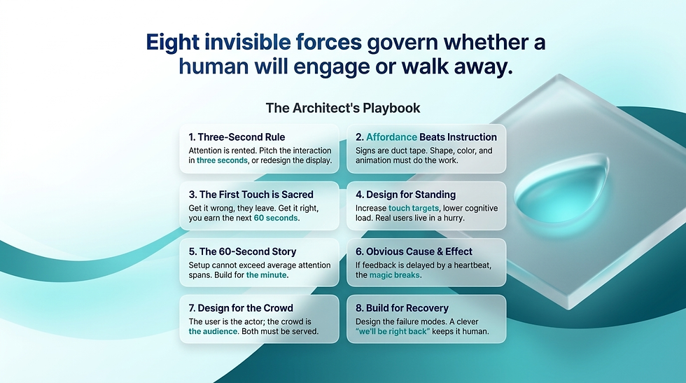
Part 3: The Eight Principles That Make People Touch the Screen
These are the rules. Memorize them. They apply across every type of interactive display, every audience, every venue.
1. The Three-Second Rule.
If your display does not communicate what it is and invite the user to interact within three seconds, you have lost them. People walk fast. Their attention is rented, not owned. The first three seconds decide everything else. If you cannot pitch the interaction in three seconds, redesign the display, not the marketing copy under it.
2. Affordance Beats Instruction.
A button that looks press-able does not need a label that says PRESS ME. The shape, size, color, and subtle animation do the work. If your design needs a sign to explain itself, your design is failing. Signs are duct tape for broken affordance. Apple Store products sit there unlocked, screens awake, beckoning. No signage required.
3. The First Touch is Sacred.
The first interaction decides whether there will be a second. Visual feedback within 100 milliseconds. Sound if it fits the venue. Something that confirms the magic just happened. The first touch is your handshake. Get it wrong and the user is gone. Get it right and they will spend the next sixty seconds with you.
4. Design for Standing, Not Sitting.
Most interactive displays serve people who are upright, often in a hurry, sometimes carrying a coffee, sometimes wrangling a stroller. Touch targets need to be bigger than mobile guidelines. Text needs to be larger than your desktop instinct. Cognitive load needs to be lower than you think is necessary. Designers default to the conditions of their quiet office. Real users live in chaos.
5. The Sixty-Second Story.
Most people give you about a minute before they move on. Plan the journey around that. What do they learn or experience in sixty seconds? If setup takes longer than the average attention span, you have already lost. Build for the minute. Anything extra is gravy.
6. Make Cause and Effect Obvious.
Especially for gesture and ambient displays. The user has to feel that their movement caused the response. If feedback is delayed by more than a heartbeat, the magic breaks. If response feels random, the user gives up. Tighten the loop until you can feel it in your gut.
7. Design for the Crowd, Not Just the User.
A great interactive display creates a moment that the strangers nearby also enjoy. The kid playing with the science museum exhibit has an audience of three parents watching. Design so that audience smiles too. The best interactive displays are theaters. The user is the actor. The crowd is the audience. Both have to be served.
8. Build for Recovery, Not Perfection.
Things will go wrong. The system will crash. Someone will pour a latte on the screen. The network will lag in the worst possible moment. Design the failure modes. A frozen blue screen kills the installation. A clever, on-brand "we'll be right back" animation keeps the experience human and forgivable.
Principle | Quick gut check |
Three-Second Rule | Can a stranger 10 feet away tell what this is in three seconds? |
Affordance Beats Instruction | Have you written any signs? If yes, redesign. |
First Touch is Sacred | Does the first tap feel delightful? |
Design for Standing | Would this work at an airport at 6am? |
Sixty-Second Story | Does the user get value within sixty seconds? |
Cause and Effect Obvious | Does the response feel earned? |
Design for the Crowd | Does the audience nearby enjoy watching? |
Build for Recovery | Have you designed the failure screen? |
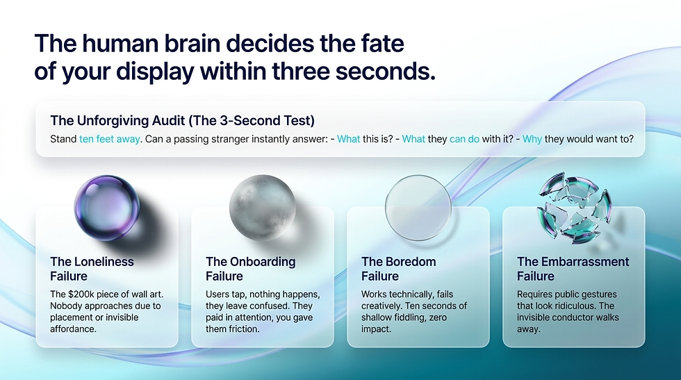
Part 4: The Four Ways Interactive Displays Fail
In the wild, interactive displays die for four specific reasons. The patterns are predictable. The good news is that knowing them means you can design against them.
The Loneliness Failure.
Nobody approaches.
The display is in the wrong spot, looks like decoration, or fails to signal that it is interactive at all.
You see this in malls, hotel lobbies, and trade show booths constantly.
The technology is fine.
The placement, the lighting, or the affordance is wrong.
A $200,000 screen with nobody in front of it is a $200,000 piece of wall art.
The Onboarding Failure.
People approach but cannot figure out what to do. They tap something. Nothing happens. They tap again. Nothing happens. They look around for help, see none, and walk away embarrassed. Now they are negative on your brand. They paid you in attention and you gave them confusion.
The Boredom Failure.
People engage but the experience is shallow. Ten seconds of fiddling and they are done. They leave with no memory of the brand, the message, or the moment. The display worked technically. It failed creatively. Engagement is not the same as impact.
The Embarrassment Failure.
The interaction requires gestures that look ridiculous in public. The user feels watched. They abandon mid-flow. This kills more gesture-based installations than any other single factor. If your gesture looks like the user is conducting an invisible orchestra, expect a lot of self-conscious half-shrugs and a lot of walk-aways.
Audit your concept against all four. If you cannot honestly say you have designed against each one, you are shipping a future case study in failure.
Part 5: The Three-Second Test
Here is the single most useful exercise in interactive display design. Stand ten feet away from your concept. Walk toward it at a normal pace. Read aloud what you understand about it within three seconds. Did it tell you:
What this is.
What you can do with it.
Why you would want to.
If any one of those three is missing or unclear, your display will fail in the field. Not might fail. Will fail. Fix it before you build.
This is unforgiving but it works. The brain decides within three seconds whether a thing is worth engaging with. You cannot negotiate with that timeline. You can only design for it.

Part 6: Designing the First Touch
The first touch is the most important interaction in the entire experience. Everything else flows from it. Get it wrong and the user leaves. Get it right and you have earned the next sixty seconds.
What makes a great first touch:
Immediate visual response.
Under 100 milliseconds.
Faster than the user can register the delay.
A reward that feels satisfying.
Color shift, animation, micro-sound.
The moment confirms the magic.
An obvious next step.
The user should know what to do next without thinking.
The screen guides them.
A small reveal.
Something appears that was not there before.
New content.
New options.
New mystery.
Look at the Apple Store iPhone on the table. You tap the home screen. Wallpapers and apps light up. The phone is not running a demo. It is the demo. The first touch is the entire pitch. The product sells itself with one finger.
Contrast that with the typical airport way-finding kiosk. You tap a destination. A loading wheel spins for three seconds. A map appears at the wrong zoom level. You squint. You give up. The first touch was a wait, a guess, and a disappointment. The brain has now associated this display with friction.
Design the first touch like it is the only touch you will ever get. Sometimes, it is.

Onboarding Without Words: The Two-Second Lesson
The dirty secret of interactive display design is that you cannot use words to teach the user how to use the thing. By the time they have read a sign, they have already decided whether to engage. Instructions are surrender.
Great installations teach the user through five wordless tricks:
The attractor loop.
The display is doing something on its own when nobody is there. A subtle animation, an idle state with hints of motion, a face that turns to look at you as you walk by. The attractor loop is the bait. It says "something is happening here, come closer."
The ghost finger.
A faint animated finger or hand silhouette on screen, demonstrating the gesture or tap that wakes the experience. Used right, it teaches in half a second. Used wrong, it patronizes. The trick is making it look like an invitation, not an instruction.
The personal echo.
The display reacts to the user's presence before they touch anything. A wave that follows their position. A shadow that mirrors their silhouette. A color that shifts as they approach. The echo is the system saying "I see you, your turn."
Progressive reveal.
The first interaction unlocks a tiny bit of the experience. The second unlocks more. The third unlocks the depth. Never dump the full feature set on the user at once. Let curiosity pull them deeper, one tap at a time.
The contagious user.
Design so that one person engaging draws others in. A reactive ripple that crosses the room. A leaderboard that updates in front of an audience. A response so visible from ten feet away that other passersby get pulled in. Crowds onboard crowds. Use that physics.
The best interactive displays in the world have zero signs and zero instructions. They teach you what to do with motion, light, sound, and time. If your display needs a tutorial, you have not designed an interactive display. You have designed a software product that happens to be mounted on a wall.
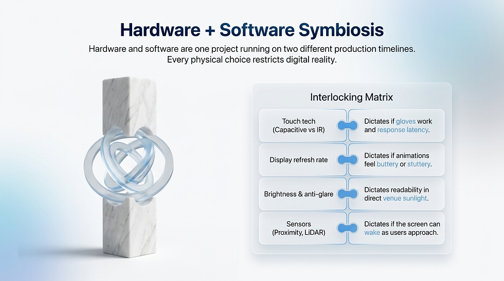
Hardware Plus Software Is One Discipline
The mistake most teams make is treating the hardware and software as two projects. They are not. They are one project running on two different production timelines, and every choice on one side constrains the other.
Things to design together from day one:
Decision | What it means for software |
Touch tech (capacitive vs resistive vs IR) | Decides whether gloves work, decides multi-touch limits, decides response latency |
Display refresh rate | Decides whether animations feel smooth or stuttery |
Brightness and anti-glare | Decides whether the screen reads in direct sun or window light |
Audio capability | Decides whether sound can be part of the feedback loop |
Sensors (proximity, motion, lidar) | Decides whether you can wake the screen as people approach |
Camera presence | Decides whether you can do faces, gestures, or AR overlays |
Network reliability | Decides whether the experience degrades gracefully offline |
Power and uptime | Decides whether the device boots fast after a power blip |
Walk through the matrix early. If the software wants something the hardware cannot deliver, you have a six-figure rework problem in month four. If the hardware can do more than the software is using, you are paying for capacity you wasted. Lock the conversation between the two teams. Make them argue in the same room before the screens get ordered.

Six Real-World Examples That Got It Right (And One That Did Not)
Theory is cheap. Examples are the real teacher. Here are six interactive displays from around the world that broke through. Each one rewards study. And one famous failure to round things out.
1. The Apple Store Table
The grandparent of retail interactive design. Products live awake on the table, fully charged, fully unlocked. No signs. No staff explanation needed. The object itself is the interface. The pitch is the touch. Everything else in retail interactive design is a footnote on this idea.
2. The Disney Park Magic Band Kiosks
Disney took the most annoying part of a theme park visit, which is checking ride wait times and customizing your wearable, and turned both into delightful moments. The kiosks are everywhere, the animations are buttery, the feedback is instant, and they are designed for tired parents holding cotton candy. Not a single sign that says "how to use this."
3. TeamLab Planets in Tokyo
Entire rooms that respond to where you stand and how you move. The whole space is the display. There is no screen. There is no interface. Visitors take their shoes off, walk in, and the room reacts. The interaction is so intuitive it feels like the building is alive. This is what gesture and ambient design can do when it is taken seriously.
4. The Coca-Cola Happiness Machine
Technically, a vending machine. Practically, a master class in interactive surprise. You push the Coke button expecting a Coke. The machine then dispenses pizzas, bouquets of flowers, foot-long sandwiches, and more Cokes than you can carry. The "interaction" was a single button push. The response was so disproportionate it went viral. Sometimes the best interactive design is a small input with a massive output.
5. The MOMA Interactive Touch Walls
Visitors can dig through digital archives, zoom into brushstrokes on famous paintings, and watch interview footage with artists. The genius is in pacing. The walls do not rush you. They reward depth. A visitor can stand at one for fifteen minutes and not run out of things to discover.
6. The IKEA AR Showroom
Customers point a tablet at their living room (through the kiosk) and see how a sofa would look in their actual home before they buy. This solves a real, expensive customer problem (the dreaded "we got it home and it does not fit"). It is interactive design in the service of a business outcome, which is the rarest and best version of this discipline.
And one famous miss: most Times Square LED walls.
The walls are technically interactive.
Some accept QR codes from phones.
Some respond to crowd movement.
But the vast majority just blast ads at people who are already drowning in ads.
Engagement is near zero.
The lesson is that having interactive capability and using it well are two different things.
A canvas this big should be reacting to the crowd, not yelling at it.

Accessibility Is Not Optional
Most interactive displays are designed for one user. A right-handed, average-height adult with full vision, full hearing, full mobility, and zero anxiety. Most actual users are not that person. The kid is too short. The grandparent has cataracts. The wheelchair user cannot reach the top half of the screen. The shopper does not speak the default language. The person on the spectrum finds the sound loop overwhelming.
If your display only works for the imaginary average user, you have built something that excludes most of the real audience.
Five things every interactive display should ship with:
A reachable interaction zone for wheelchair users and kids.
The most important interactive elements live between 36 and 48 inches off the floor. Anything above that is decoration for some part of the audience.
High-contrast modes that turn on automatically or with one tap.
Glare, sunlight, and aging eyes do not negotiate. Build the high-contrast version first and the brand-prettiest version second.
Text-to-speech for the entire interface.
Not a nice-to-have. People with vision impairments use displays in the wild every day. If your display has audio capability, build a screen reader path into it from day one.
Captions for any video or audio content.
Most public venues are loud. Audio frequently does not land. Captions help everyone, not just the deaf and hard-of-hearing.
Multiple language paths that are not buried in a settings menu.
One tap to switch. Detect the user's phone Bluetooth or browse cookies if the venue allows it. At minimum, English plus the two most common visitor languages for that venue should be a single tap away.
Accessibility is also good business. The legal exposure of a public installation that fails ADA or WCAG standards is real and rising. The reputational damage of a viral video of somebody unable to use your display in front of their kids is worse. Build for everyone or build for nobody.

7 Mistakes Even Seasoned Teams Make
These show up in projects that should have known better. Watch out for them.
Mistake 1: Spending 80% of the budget on hardware and 20% on the content.
Reverse this. The hardware is the venue. The content is the show. A modest screen with great content beats a stunning screen with mediocre content every single time.
Mistake 2: Designing for a quiet office instead of a chaotic public space.
Your prototype works fine on a 27-inch monitor at your desk in a silent room. Now imagine it under fluorescent lights, with a stroller passing every 30 seconds, and a kid trying to lick the screen. Design for that, not your office.
Mistake 3: Forgetting the user might have wet hands, gloves, or be left-handed.
Capacitive touch does not love gloves. Restaurant displays meet wet hands. Right-handed designers test only right-handed flows. The real world has more variability than your test plan.
Mistake 4: Designing for adults when half your users are kids.
Especially in retail, museums, and family venues. Touch targets should accept smaller hands. Reading levels should be flexible. Sounds should not make babies cry. If your concept fails the eight-year-old test, redesign.
Mistake 5: Not testing in the actual lighting and sound environment.
Studio lighting is forgiving. Daylight through a glass storefront is brutal on screens. Loud background music drowns out audio feedback. Test in the actual venue, not a clean room. Bring the screen on site before you sign off.
Mistake 6: Letting marketing dump ads into the experience.
Nothing kills interactivity faster than the user realizing they are being sold to. Brands earn their place through the experience, not by interrupting it. If the message is woven into the moment, it works. If it pops up like a banner, it is over.
Mistake 7: Building it once and forgetting it.
Interactive displays are not posters. They are restaurants. If the menu never changes, the regulars stop coming. Plan content refresh into the project from day one. Budget for it. Hire for it. If you cannot maintain it, do not build it.
Looks fine on a screenshot | Actually works in the venue |
Big animations, tight margins | Big touch targets, generous margins |
Designed in studio lighting | Tested in venue lighting |
Built once, shipped, forgotten | Content refreshed quarterly |
Marketing-led messaging | Experience-led storytelling |
Assumes one user at a time | Designed for the crowd around them |

Quick Answers to the Questions Every Team Asks
How much should a good interactive display cost?
A useful kiosk-class installation starts around $15,000 to $25,000 all-in (hardware, software, content, install). A flagship retail or museum experience runs $80,000 to $300,000. Truly bespoke architectural installations run into seven figures. Spend more on content and software than you do on the screen itself. The screen wears out. The experience is what people remember.
How long should the interaction last?
Plan around sixty seconds for a casual user, three to five minutes for an engaged one. If your average dwell time is under fifteen seconds, the design is failing. If it is over six minutes for a public venue, you are slowing down everyone else in the line.
How do we measure success?
Three numbers. Approach rate (out of people walking by, how many stopped). Engagement rate (out of people who stopped, how many touched). Completion rate (out of people who touched, how many finished the experience). Track all three over time. The first one tells you about placement and affordance. The second tells you about the first touch. The third tells you about the content.
Should we use AI or generative content?
If it makes the experience feel more personal and responsive, yes. If it is decoration, no. AI in interactive displays is at its best when it adapts to the specific person standing there: their language, their gestures, the time of day. AI just to add AI is a budget item with no soul.
Touch or no-touch?
Touch is intuitive but has hygiene concerns and demands physical proximity. Gesture and motion feel magical but require space and clean teaching. Most great installations use a blend. The display senses approach (proximity), invites with motion, and rewards with touch.
What about outdoor installations?
Different beast entirely. Brightness has to climb above 2,000 nits to fight sunlight. Capacitive touch struggles in heavy rain. Anti-vandal glass is mandatory. Power and connectivity must survive the elements. Outdoor adds 30 to 50 percent to your budget. Plan for it from the start, not as an afterthought.

Putting It All Together
Interactive displays are not screens. They are invitations. The good ones say "come closer, you will not regret it." The bad ones say nothing, and they get nothing back.
Know the type you are designing. Apply the eight principles. Pass the three-second test. Design the first touch like your project depends on it. Onboard without words. Treat hardware and software as one job. Build for everyone, not just the imaginary average user. Steal from the greats. Avoid the seven mistakes. Refresh the content. Plan for the crowd, not just the user.
Do all of that and your display becomes the thing people stop to play with, take a photo of, and tell a friend about. Skip any of it and you join the long, expensive parade of screens that nobody touches.
The technology will keep changing. The principles will not. Touch follows attention. Attention follows curiosity. Curiosity follows good design.
Go build something worth touching.


Comments