Designing for Everyone: A Field Guide to Accessible UX Design


The Curb Cut Effect
In the early 1970s, a small group of disabled activists in Berkeley, California, took sledgehammers to the curbs of their city. They were protesting the fact that wheelchair users could not cross the street. The city eventually relented and built curb cuts: the small ramps you see at every intersection.
Here is the thing nobody predicted. Once the curb cuts were in place, everyone benefited. Parents with strollers. Delivery workers with dollies. Travelers with luggage. Cyclists. Skateboarders. The elderly. Movers. A feature designed for one community of users turned out to help every community of users.

This is the curb cut effect. It is the entire argument for accessible UX design in a single image.
Texting was invented to help the deaf communicate. Now everyone texts. Voice control was invented for people with motor disabilities. Now everyone yells at their Alexa. Closed captions were a deaf accommodation. Now they run in every bar, every gym, every TikTok video on mute.

Accessibility is not charity. It is not compliance theater. It is not a checkbox at the end of a project. Done right, it is the design discipline that makes your product better for everyone, more durable in the market, and more defensible in the courts.
This guide is the field manual. By the end you will know who you are actually designing for (it is more people than you think), the five pillars of accessible design, the twelve practical rules that move the needle, the Microsoft inclusive design lens that turns the conversation, WCAG translated into plain English, how to test for what matters, real examples to steal from, and the mistakes even senior designers keep making.
Let's get into it.


Part 1: Why Accessibility Is Not Optional
If you still think of accessibility as a nice-to-have, you are working from an out-of-date map. Three forces have made it non-negotiable for any serious product team.
The market is bigger than you think.
Roughly one in four adults in the United States lives with a disability. Globally, more than a billion people. Add aging populations and the number keeps climbing. If you design only for the imaginary average user, you are walking away from a quarter of your potential audience. No business plan survives that.

The legal exposure is rising.
The Americans with Disabilities Act, Section 508 in the US, the European Accessibility Act, AODA in Canada, the Equality Act in the UK. The list grows every year. Lawsuits over inaccessible digital products are now routine. Domino's, Target, Beyonce's website. All sued. All lost or settled. The legal floor keeps moving up. Building inaccessible products is borrowing money at high interest from your future legal team.
Disability is not a fixed category.
Every human is temporarily able-bodied. You break an arm. You get a migraine. You hold a baby. You walk through bright sunlight. You sit in a loud bar. You age. Every one of these moments puts you in the disabled bucket for a short window. Accessibility is not designing for someone else. It is designing for your future self on a bad day.
The teams that get this build better products. The teams that do not build legal liability.

Part 2: The Five Pillars of Accessible Design
Most accessibility frameworks teach four principles. They come from WCAG and they are good. There is a fifth that gets less attention and matters just as much. Hold all five together and the work becomes clear.
1. Perceivable.
Users have to be able to take in the information. If they cannot see your text because of contrast, hear your video because of missing captions, or feel your button because the touch target is too small, the content does not exist for them. Perceivable is the foundation. Get this wrong and nothing else matters.
2. Operable.
Users have to be able to use the interface with whatever input they have. Keyboard only. Switch device. Voice command. Eye tracker. One hand. Shaky hands. If your product only works with a perfect mouse and a steady index finger, you have excluded a lot of humans.

3. Understandable.
Users have to be able to make sense of what they are seeing and doing. Plain language. Predictable patterns. Errors that explain themselves. A feature that requires a manual is a feature that excludes anyone with cognitive load issues, anyone reading in a second language, anyone in a hurry. Which is most users.
4. Robust.
Users have to be able to access your content with whatever technology they use. Screen readers. Voice control. Old browsers. New browsers. Assistive devices you have never heard of. Robust means your product survives contact with the real world of users, not just the Chrome browser on a 27-inch monitor.
5. Inclusive.
The fifth pillar, which most frameworks skip. Beyond the technical requirements, did you actually design with disabled users at the table, in plural, from the start? Or did you design for them, which is a different thing? Nothing about us without us is the disability community's mantra for a reason. If your accessibility decisions came entirely from people without lived experience, you are guessing.
WCAG calls the first four POUR. The fifth pillar (inclusive) is what separates products that pass an audit from products that disabled users actually love. Pass the audit. Then earn the love.

Part 3: Who You Are Actually Designing For
Most designers, when asked to picture a user with a disability, picture a wheelchair user. Wheelchair users matter, but they are a small fraction of the total. The real spectrum is wider and more interesting.

Here is the honest landscape.
Category | What it includes | Approximate share of users affected |
Vision | Blind, low vision, color vision deficiency, cataracts, light sensitivity | Around 5% of adults globally are blind or have low vision. Around 8% of men and 0.5% of women have some color vision deficiency. |
Hearing | Deaf, hard of hearing, auditory processing, age-related hearing loss | Around 15% of adults globally have some hearing loss. Climbs significantly with age. |
Motor | Paralysis, amputation, arthritis, tremor, cerebral palsy, repetitive strain | Hundreds of millions globally. Increases with age. |
Cognitive | ADHD, dyslexia, autism, traumatic brain injury, anxiety, depression, dementia | Estimates suggest 15 to 20% of adults globally have some neurodivergence or cognitive condition. |
Speech | Stutter, mutism, speech apraxia, post-stroke aphasia | Smaller share but critical for voice-first interfaces. |
Temporary | Broken bones, post-surgery, eye dilation, medication side effects | Every human at some point. |
Situational | Bright sun, loud room, one hand busy, distracted, tired, drunk | Every human, every day. |
Notice the bottom two rows. Temporary and situational disabilities affect 100% of users some of the time. Designing for them is not charity. It is designing for the actual conditions your product gets used in. The mom with one hand on the stroller. The commuter on a jostling subway. The exhausted parent at 2am trying to feed the baby. These are your users too.

Part 4: The Twelve Practical Rules That Move the Needle
Theory is for blog posts. Practice is for ship dates. Here are the twelve rules that, applied consistently, get most products to a strong accessibility baseline. None of them require permission from leadership. All of them are within a designer's daily authority.
1. Hit the contrast ratios.
Body text: 4.5:1 against the background. Large text (18px+ regular or 14px+ bold): 3:1. UI components and graphical objects: 3:1. Use a contrast checker. Every screen, every state, every theme. If it does not pass, redesign it. This single rule alone fixes more accessibility problems than any other.
2. Never use color as the only indicator.
Red for error, green for success is fine. But never the only signal. Add an icon, a label, a shape, a pattern. Color blind users (8% of men) cannot reliably tell red from green. If you take away the color, can the user still understand what is happening? If not, redesign.
3. Touch targets at least 44 by 44 pixels.
Apple's HIG says 44. WCAG AAA says 44. Most professionals aim for 48. Smaller than that and users with motor issues, tremor, or fat fingers (which is most fingers in real-world conditions) start missing. Generous spacing between targets matters as much as the size.
4. Caption and transcribe every video.
Auto-captions are a starting point. Real captions are reviewed by a human. Transcripts are searchable, copy-pasteable, and SEO-friendly. Captions help the deaf. They also help users in noisy environments, users in quiet libraries, users learning a language, and Google's search crawler. The curb cut effect at its purest.

5. Alt text for every meaningful image.
Decorative images get alt="" so screen readers skip them. Meaningful images get descriptive alt text that explains what the image is communicating. A photo of a graph needs the data, not "image of a graph." If the image conveys information, the alt text must convey it too.
6. Use semantic HTML.
Buttons that look like buttons need to be button elements, not divs with click handlers. Headings need to be in order (h1, h2, h3, not h1, h3, h2). Lists need to be lists. Tables need to be tables. Screen readers depend on this structure. Misusing HTML elements is the single most common technical accessibility failure on the web.
7. Make keyboard navigation work everywhere.
Tab order is logical. Every interactive element is reachable. Modals trap focus appropriately. Escape closes things. Enter activates buttons. Test your product by unplugging your mouse for an hour. If you cannot complete a core task with keyboard alone, neither can a screen reader user.
8. Visible focus states everywhere.
When the user tabs to an element, a clearly visible focus indicator must appear. Not a faint blue outline you have to squint to see. A real, contrast-passing, can-see-it-from-the-back-of-the-room indicator. Default browser focus styles are usually fine. Removing them with CSS outline:none and not replacing them is one of the most common accessibility crimes.

9. Form labels that are actually labels.
Every input has an associated label element. Placeholder text is not a label. Floating labels are tolerable if implemented correctly. Required fields are marked clearly. Error messages tie back to the specific field. Forms are where most users get lost. Forms are also where accessibility is most often broken.
10. Error messages that help.
Bad: "Invalid input." Good: "Phone number must be 10 digits." Great: "Phone number must be 10 digits. You entered 9." Tell the user what went wrong, where it went wrong, and what to do about it. Loud red text alone is not enough. Voice the problem like a helpful human.
11. Respect the prefers-reduced-motion setting.
Some users get motion sickness, vestibular disorders, or seizures from heavy animation. Most operating systems now let users set a system-level preference to reduce motion. Detect it and respond. Heavy animation off. Subtle motion fine. Auto-playing video paused. Your product feels considered, your users feel seen.
12. Text that scales without breaking.
Some users zoom the browser to 200%. Some change their default font size. Your layout should handle that gracefully. Use relative units (rem, em, %), not fixed pixels for typography. Containers should grow. Text should not get cut off. The reading experience should hold together at any zoom level your users actually use.
Apply these twelve rules consistently and you will pass roughly 80% of the WCAG AA criteria without thinking about it. The rest is detail work. The hard part is the discipline, not the knowledge.

Part 5: The Microsoft Inclusive Design Lens
Microsoft's inclusive design toolkit reframes accessibility in a way that changes the conversation. Instead of "users with disabilities," it asks you to think in three time horizons.
Type | Vision example | Motor example | Hearing example | Cognitive example |
Permanent | Blind | One-armed | Deaf | Autistic |
Temporary | Eye dilation after exam | Broken arm | Ear infection | Concussion |
Situational | Driving in bright sun | Holding a baby | In a loud bar | Sleep-deprived |
Here is the lens. If you design for the permanent column, the temporary and situational columns get solved for free. The curb cut, again. The voice interface that helps the blind also helps the driver, the new parent, the cook with messy hands, and the writer with carpal tunnel.
This reframe matters because it kills the "that is an edge case" argument. The edge case is the entry point. It is the most demanding version of a need that affects millions of people in milder forms every day. When somebody on your team dismisses an accessibility request as too niche, ask them to fill in the temporary and situational columns for that need. The argument falls apart.
Part 6: WCAG in Plain English
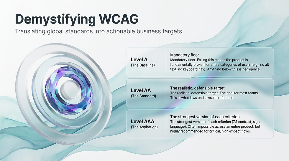
The Web Content Accessibility Guidelines are the global standard. They are also written like a tax code. Here is the translation.
Level | What it means | Realistic target? |
Level A | The absolute baseline. If you fail Level A, your product is broken for entire categories of users (no alt text, no keyboard nav, video without alternatives). | Mandatory floor. Anything below this is negligence. |
Level AA | The realistic, defensible standard. Better contrast, better navigation, better forms, better captions. This is what laws and lawsuits reference. | Yes. This is the goal for most teams. Aim here. |
Level AAA | Aspirational. Higher contrast (7:1), sign language for videos, no time limits anywhere, the absolute strongest version of each criterion. | Not always possible across an entire product. Apply to high-impact flows like signup, checkout, account recovery, support. |

A few realities most teams learn the hard way. WCAG AA is the lowest bar that holds up in court. AAA is hard to maintain across an entire product, but worth targeting in your most important flows. Most accessibility lawsuits cite specific WCAG AA failures, so passing AA is not just ethical, it is risk management.
If your team is at Level A or below, the most useful next step is not to memorize WCAG. It is to run a baseline audit and prioritize the top ten issues. Then keep going.

Part 7: How to Actually Test for Accessibility
Most teams test accessibility by running a Lighthouse audit, seeing a number, and calling it a day. That is one tool. There are four. Use all of them and you will catch ten times more issues.
Automated tools (catch the obvious).
Run Axe, WAVE, or Lighthouse against every screen. These tools catch missing alt text, contrast failures, missing labels, broken heading orders, and similar mechanical issues. They will find roughly 30 to 40% of real accessibility problems. They are necessary but nowhere near sufficient.
Manual keyboard testing.
Unplug your mouse. Navigate your product entirely with Tab, Shift+Tab, Enter, Space, and arrow keys. Can you complete every core task? Are focus indicators visible? Does anything trap your focus? If a flow breaks for keyboard, it breaks for every screen reader user, every motor-disabled user, and every power user who lives on keyboard shortcuts.
Screen reader testing.
Learn VoiceOver on Mac (Cmd+F5) or NVDA on Windows (free download). Both take about an hour to learn at a survivable level. Then run a screen reader through your most important flows. You will discover that your forms read like "button button button" and your headings make no sense. Painful, but you cannot fix what you have not felt.
Testing with actual disabled users.
The most valuable signal you will ever get. Recruit a few users with permanent disabilities through services like Fable, Userlytics, or your local disability community. Pay them well, listen carefully, and watch them use your product. Twenty minutes of watching one blind user use your signup flow will teach you more than ten Lighthouse reports.
If you only have time for one of these, do the keyboard test. It takes 20 minutes per flow and surfaces the most expensive issues. If you have time for two, add the screen reader. If you have time for three, recruit one disabled user per quarter and watch them work. The investment compounds.

Part 8: Real Examples of Accessibility Done Brilliantly
Theory is cheap. Examples teach. Here are six products and features where accessibility is not bolted on but genuinely well crafted. Each one rewards study.
1. Apple VoiceOver and Switch Control.
VoiceOver is the gold standard screen reader. Switch Control lets users with severe motor disabilities operate an iPhone with one button or one breath. Together they let blind, deaf-blind, and motor-disabled users use the same product as everyone else, without modification. Apple did not build a separate accessible version. They made the main product accessible. That is the move.
2. The Microsoft Xbox Adaptive Controller.
A modular game controller designed for users with limited mobility. Big programmable buttons. Ports for foot pedals, joysticks, and switches. Out of the box it costs $100. It works with any Xbox game on the market. Microsoft did not lower the standard. They made the controller fit the player.
3. Be My Eyes and Be My AI.
Be My Eyes connects blind users to sighted volunteers via video call. Need to read a label, identify a sweater color, find a cab? Tap, call, get help. Be My AI uses GPT-4 to do the same thing instantly with no human in the loop. A blind user can point their phone at a menu and hear it read back, summarized, translated, contextualized. AI accessibility at its best.
4. Google Live Caption.
System-level captions for anything making sound on the phone. Videos, podcasts, calls, voice notes. Deaf users get captions even on content that does not have them. Hearing users in libraries, planes, and meetings benefit too. Built once, into the OS, available everywhere.
5. The Sesame Street character Julia.
Sesame Street introduced Julia, an autistic muppet, with careful collaboration from autistic adults and child psychologists. The character is portrayed authentically, not as a caricature, and the show models inclusive friendship for an audience of millions of kids. Representation is design too. Done well, it shifts how a generation thinks.
6. The BBC iPlayer accessibility menu.
Every video on iPlayer has subtitles, audio descriptions, sign language interpretation, and adjustable text size, all reachable from one menu. The BBC made accessibility a brand promise, not a feature flag. The viewers noticed. The competitors are still catching up.

Part 9: Seven Mistakes Even Senior Designers Make
These show up in teams that should know better. Watch for them.
Mistake 1: Treating accessibility as a checklist, not a mindset.
Checklists are a starting point. They are not the goal. Teams that ship great accessibility think in terms of users, not criteria. The checklist is a smoke test, not a strategy.
Mistake 2: Designing for the wrong "average user."
If your persona is a 32-year-old able-bodied digital native with perfect vision in a quiet office, you have built a product for a fraction of your audience. Your personas should include disability dimensions or you are designing in a fantasy.
Mistake 3: Ghettoizing accessibility into a separate flow.
A "high contrast version" that lives behind a settings menu. An accessibility statement page that links to a static PDF. A separate site for screen reader users. These are all signals that accessibility is being treated as second-class. Build it into the main product or do not bother.
Mistake 4: Treating WCAG AA as the ceiling, not the floor.
AA is the legal floor. The product that delights disabled users hits AAA in critical flows and reaches beyond the standard where the standard is silent. Aim higher than compliance.
Mistake 5: Forgetting cognitive accessibility.
Most accessibility discourse focuses on vision and motor. Cognitive accessibility (clear language, predictable patterns, low distraction, simple recovery from mistakes) gets less attention and affects the most users. Plain language is an accessibility feature. So is consistent navigation.
Mistake 6: Forgetting that disability is intersectional.
A deaf user might also be blind. A blind user might be a wheelchair user. A user with ADHD might also be autistic. The user with three disabilities is not a hypothetical. Build flexibly enough that combinations work.
Mistake 7: Asking disabled users to do unpaid labor.
Recruiting disabled users to test your product and not paying them, or paying them less than you pay sighted testers, is exploitation. Pay properly. Disabled testers are professionals doing professional work. The data they provide is worth more than you are paying them. Honor that.

Looks accessible | Is accessible |
Has an accessibility statement page | Has an accessibility roadmap with owners |
Passes Lighthouse | Passes a keyboard test and a screen reader pass |
WCAG AA badge in the footer | Disabled users have been in the room |
High contrast theme available | Default theme already passes contrast |
Alt text written by the developer | Alt text reviewed by a content designer |
Accessibility done at end of project | Accessibility owned from kickoff |

Quick Answers to the Questions Every Team Asks
When in a project should we start thinking about accessibility?
From the kickoff. Earlier is always cheaper. Retrofitting accessibility into a finished product can cost 5 to 10 times what building it in from the start costs. The product team that treats accessibility as a phase-three concern is the product team that has a phase-five rewrite ahead of it.
What is the difference between accessibility and inclusive design?
Accessibility makes a product usable by people with disabilities. Inclusive design considers a much broader range of human diversity (race, gender, age, language, neurology, culture, body size, technology access) and designs with that diversity at the table. Accessibility is a subset of inclusive design. You can do accessibility without inclusivity, but you cannot do inclusive design without accessibility.
How much time and budget does this add to a project?
Built in from the start, accessibility adds roughly 5 to 10% to design and development time and that cost goes down with practice. Bolted on at the end, it can double the cost of a release. Treat it like security. The cheap version is the early version.

What about AI features and accessibility?
AI is one of the biggest accessibility wins in recent history. Automatic alt text. Real-time captioning. Visual description for the blind. Language simplification. Voice-first interfaces. But AI also introduces new failures: hallucinated captions, biased speech recognition, models that do not understand non-standard speech. Treat AI features as accessibility opportunities and accessibility risks at the same time.
Do we need a specialist?
Eventually, yes. A dedicated accessibility lead or consultant pays for themselves at any organization shipping consumer or enterprise products at scale. Before you have one, the next best move is to send your most senior designer to a serious accessibility training and have them embed the discipline into your team's daily process.
What is the ROI on accessibility work?
Three measurable returns. Larger addressable market (the 25% of users you were excluding). Reduced legal exposure (lawsuits are expensive, settlements more so). Better usability for everyone (the curb cut effect again). Most teams that take it seriously also report stronger SEO, lower support costs, and better employee morale. Accessibility is a productivity story dressed up as an ethics story.

Putting It All Together
Accessibility is not a feature. It is not a phase. It is not somebody else's job.
It is the discipline of designing for the actual humans who will use your product, in the actual conditions they will use it, with the actual range of abilities they actually have. Permanent, temporary, situational. Across vision, hearing, motor, cognitive, and speech. Across all the messy intersections where life happens.
Apply the twelve practical rules. Hit WCAG AA. Run the four tests. Steal from the greats. Avoid the seven mistakes. Pay the disabled users you work with. Treat the curb cut effect as a gift, not a tax.
Do all of this and your product gets better for everyone. Skip any of it and you join the long list of companies who got sued, embarrassed, or quietly abandoned by the audience they thought they could afford to ignore.
The best accessibility work disappears into the product. Users with disabilities should not feel like guests in your design. They should feel like the design was made for them too, because it was.
Go build something everyone can use.


Comments